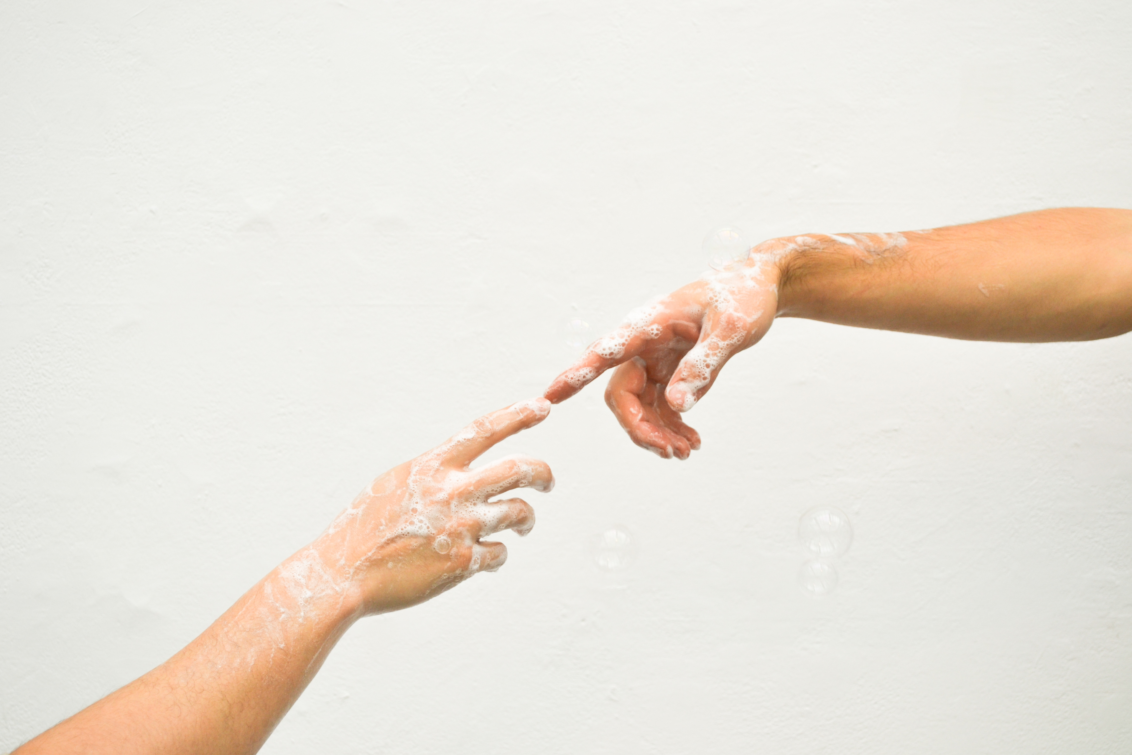
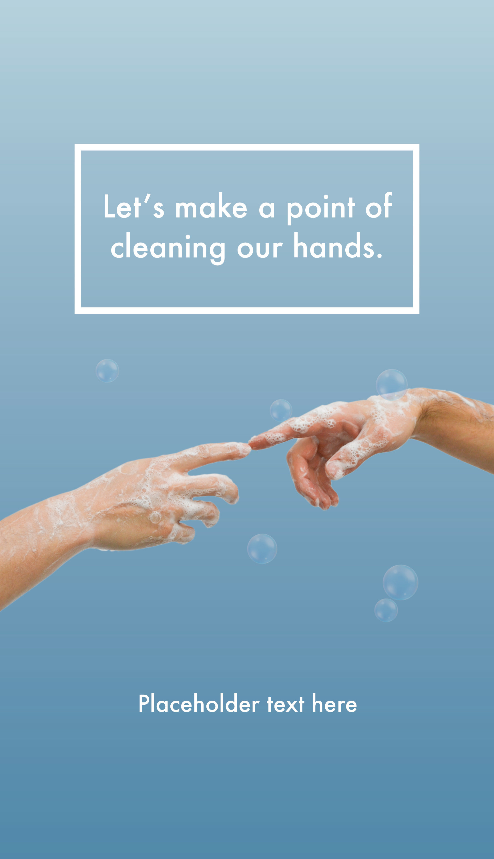
Poster with the slogan 'Let's make a point of cleaning our hands'. Two soapy hands touch at the index fingers against a light blue gradient background.
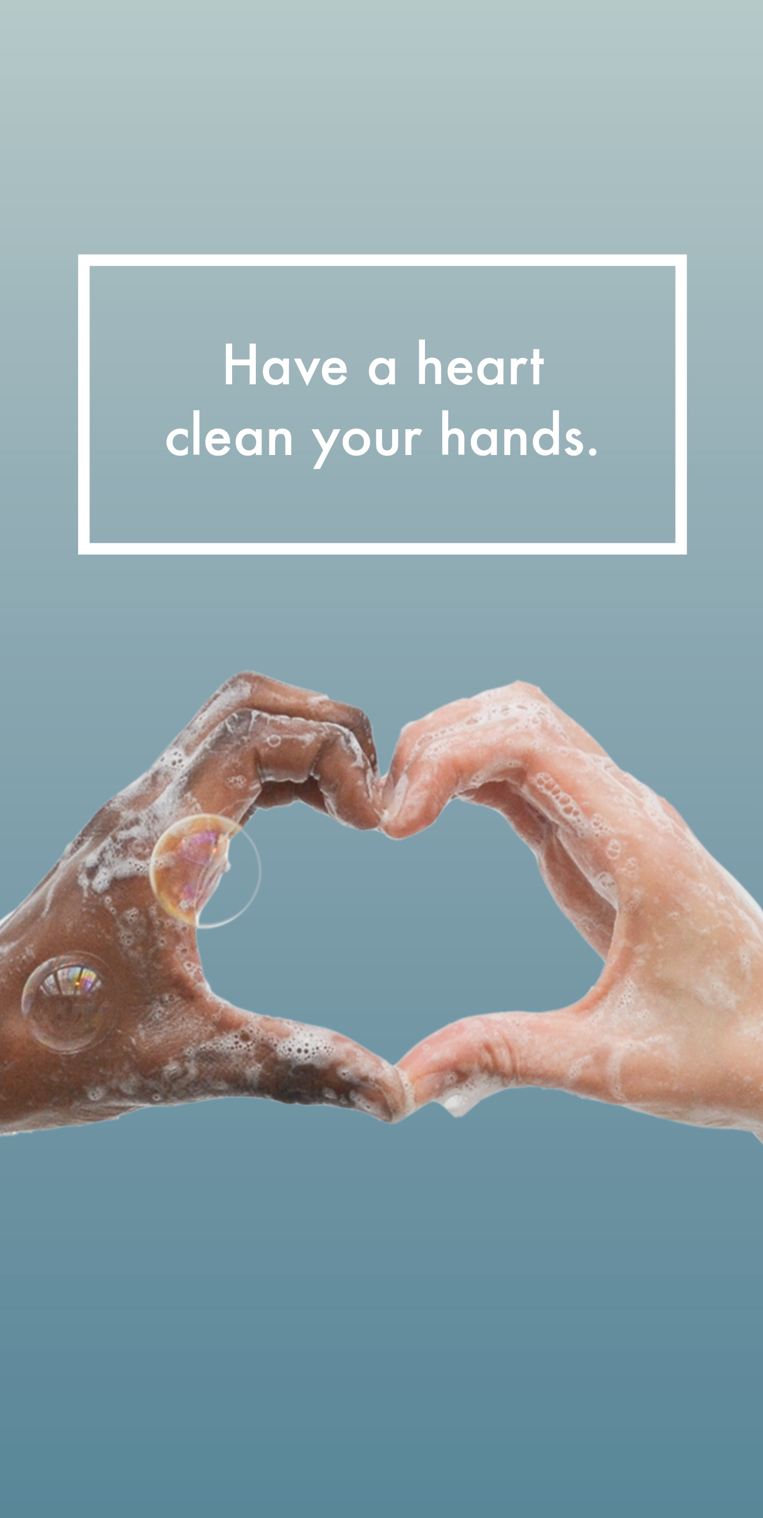
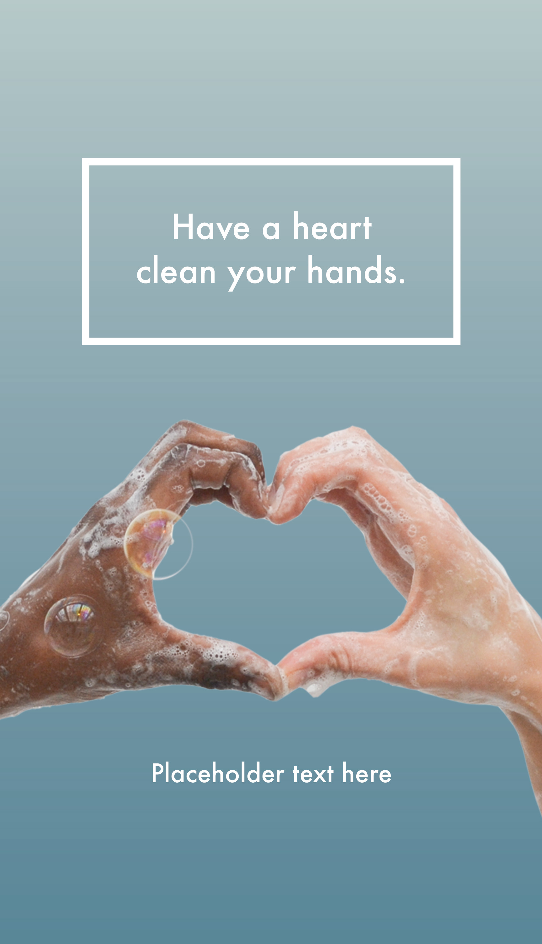
Poster with the slogan 'Have a heart clean your hands'. Two soapy hands come together to form a heart shape against a grey-blue gradient background.
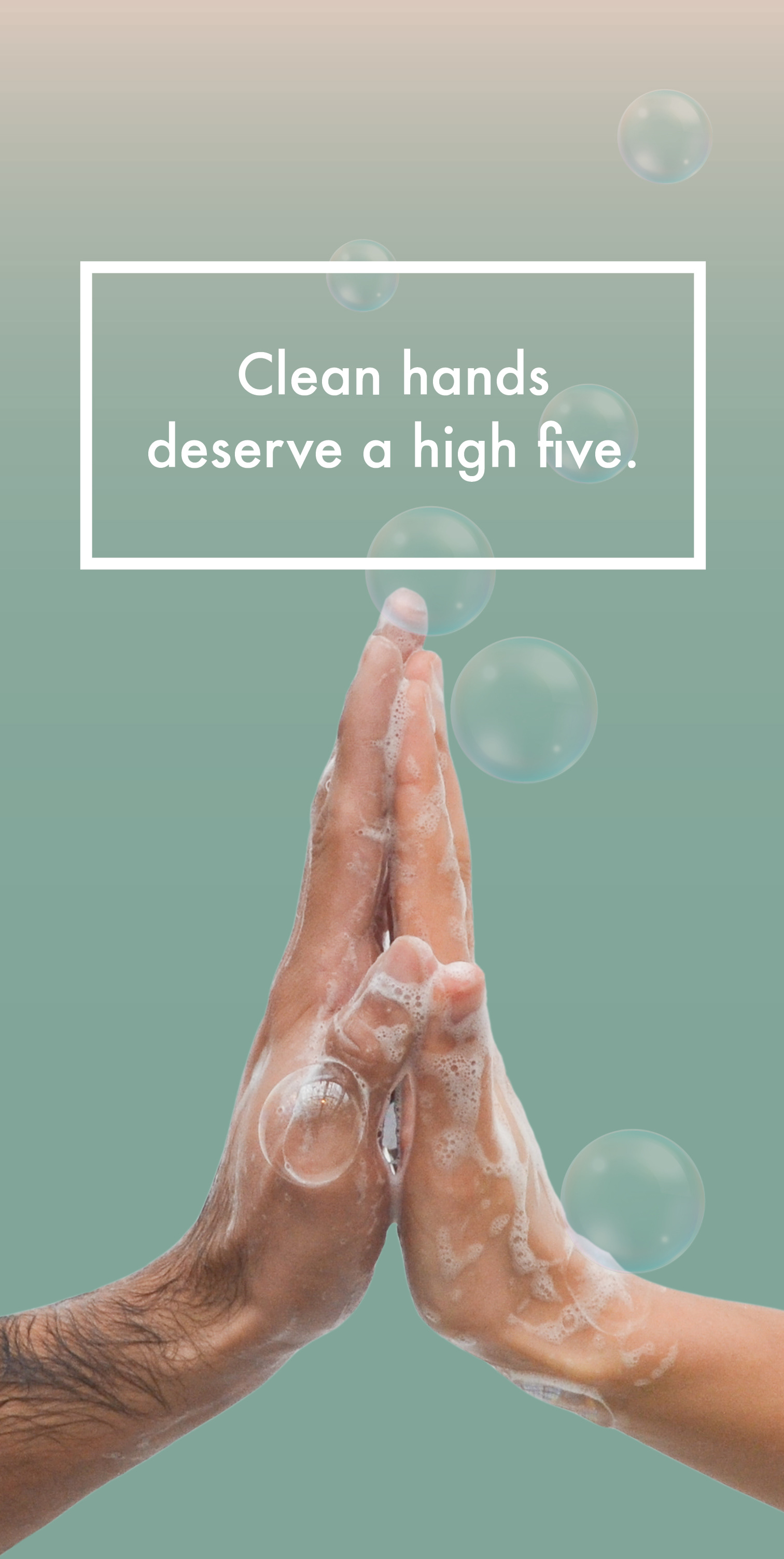
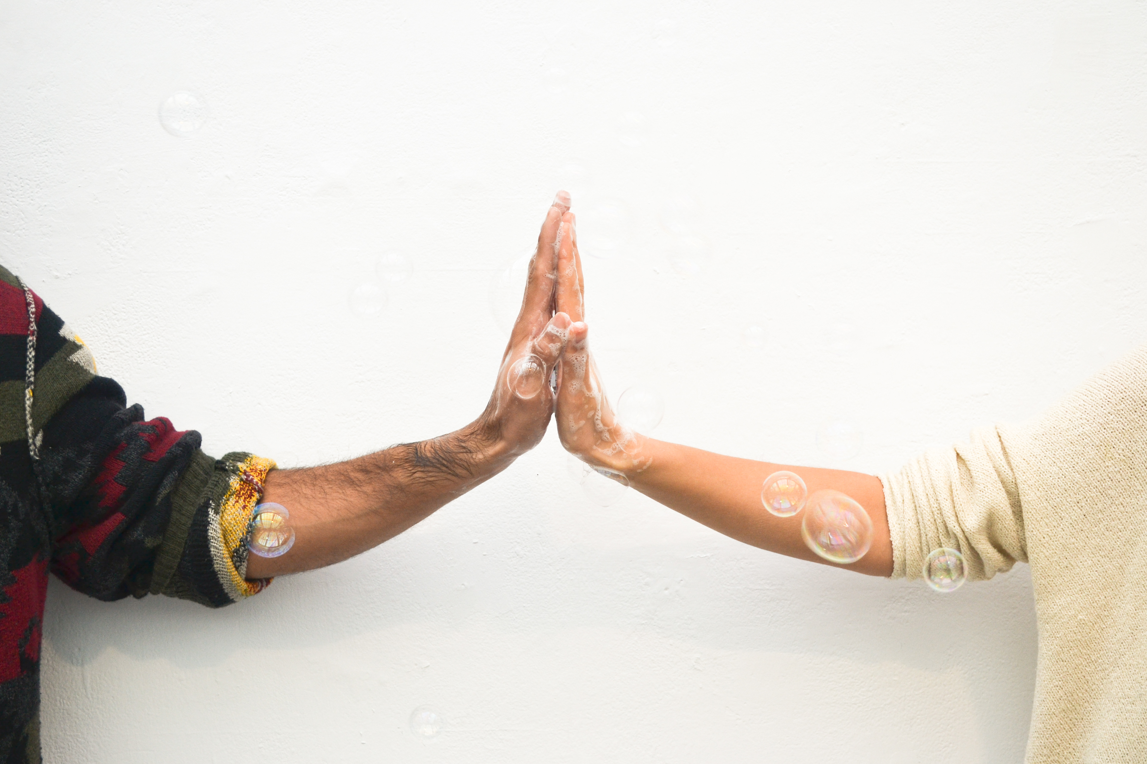
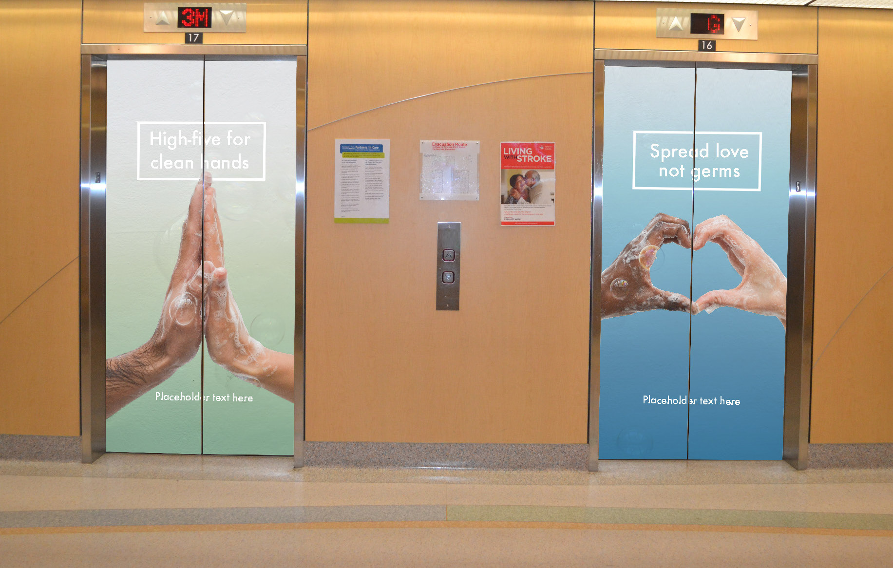
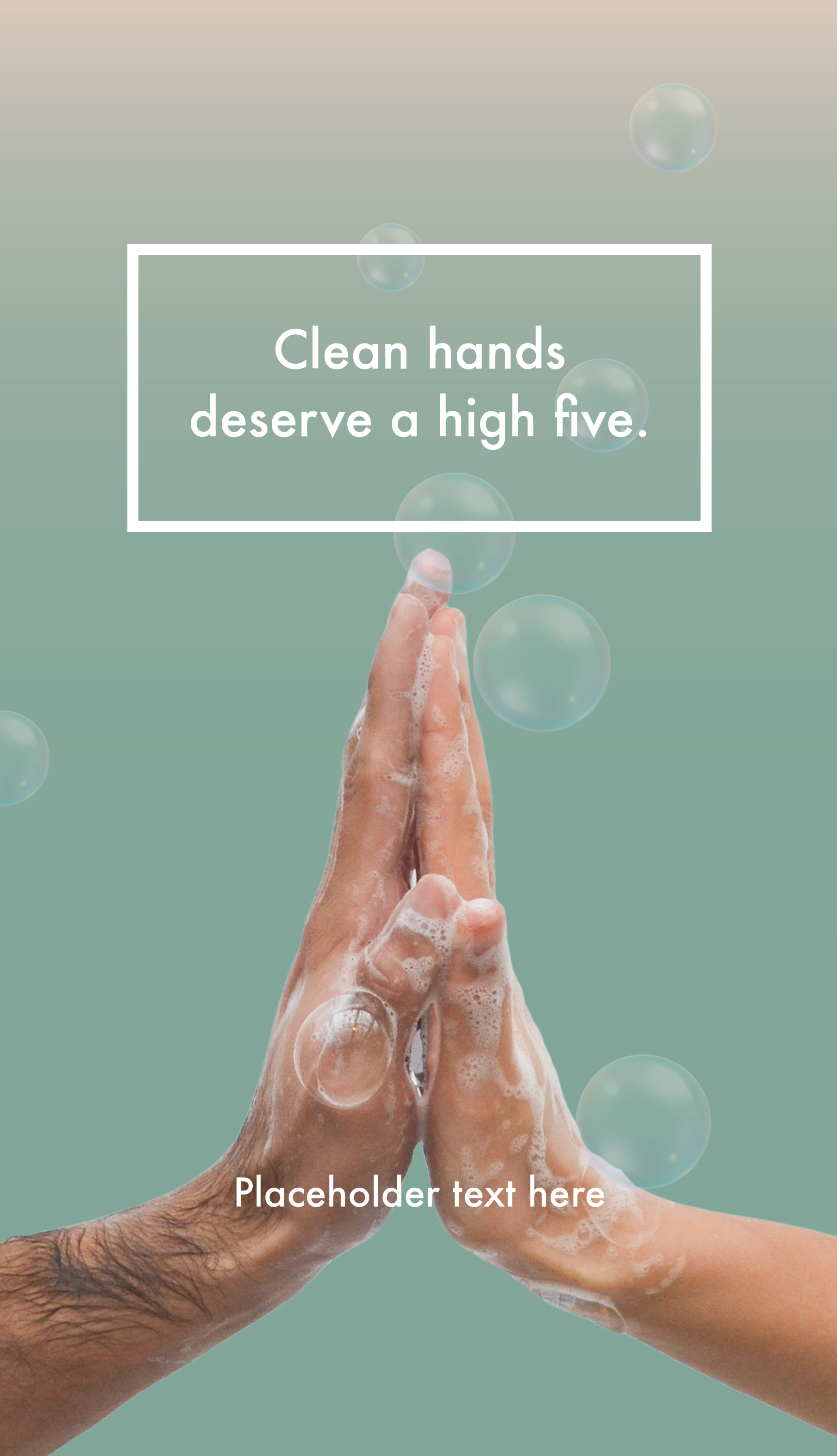
Poster with the slogan 'Clean hands deserve a high five'. Two soapy hands giving a high five against a green background.
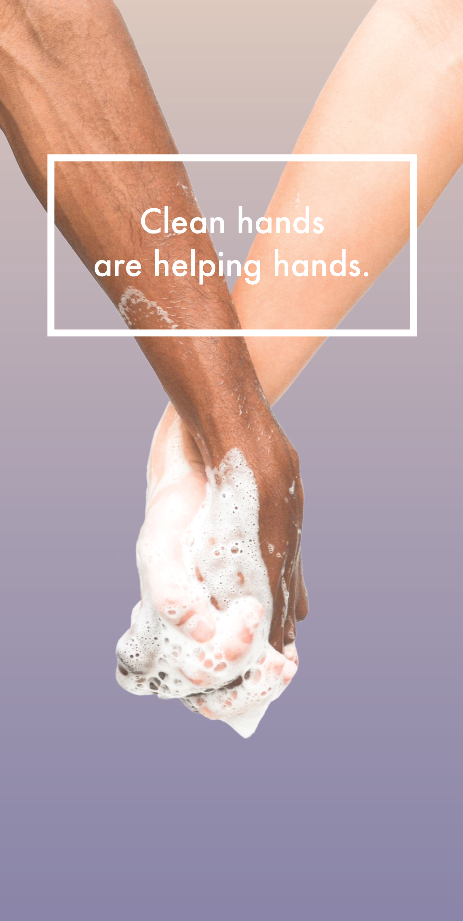
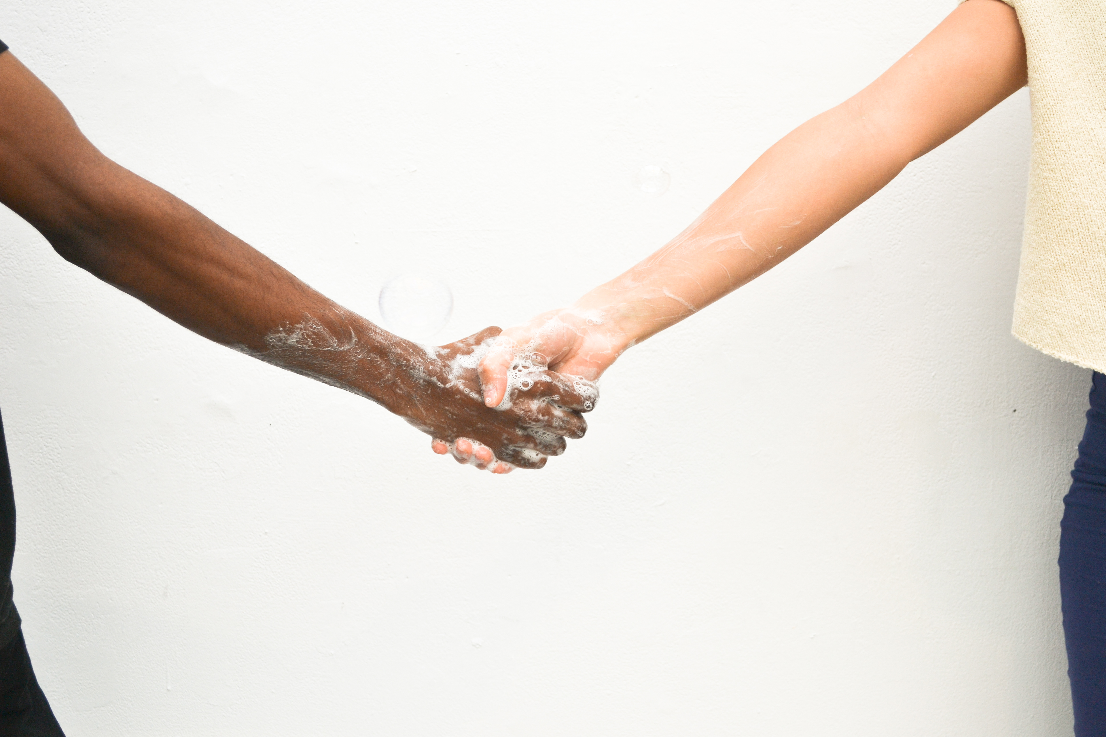
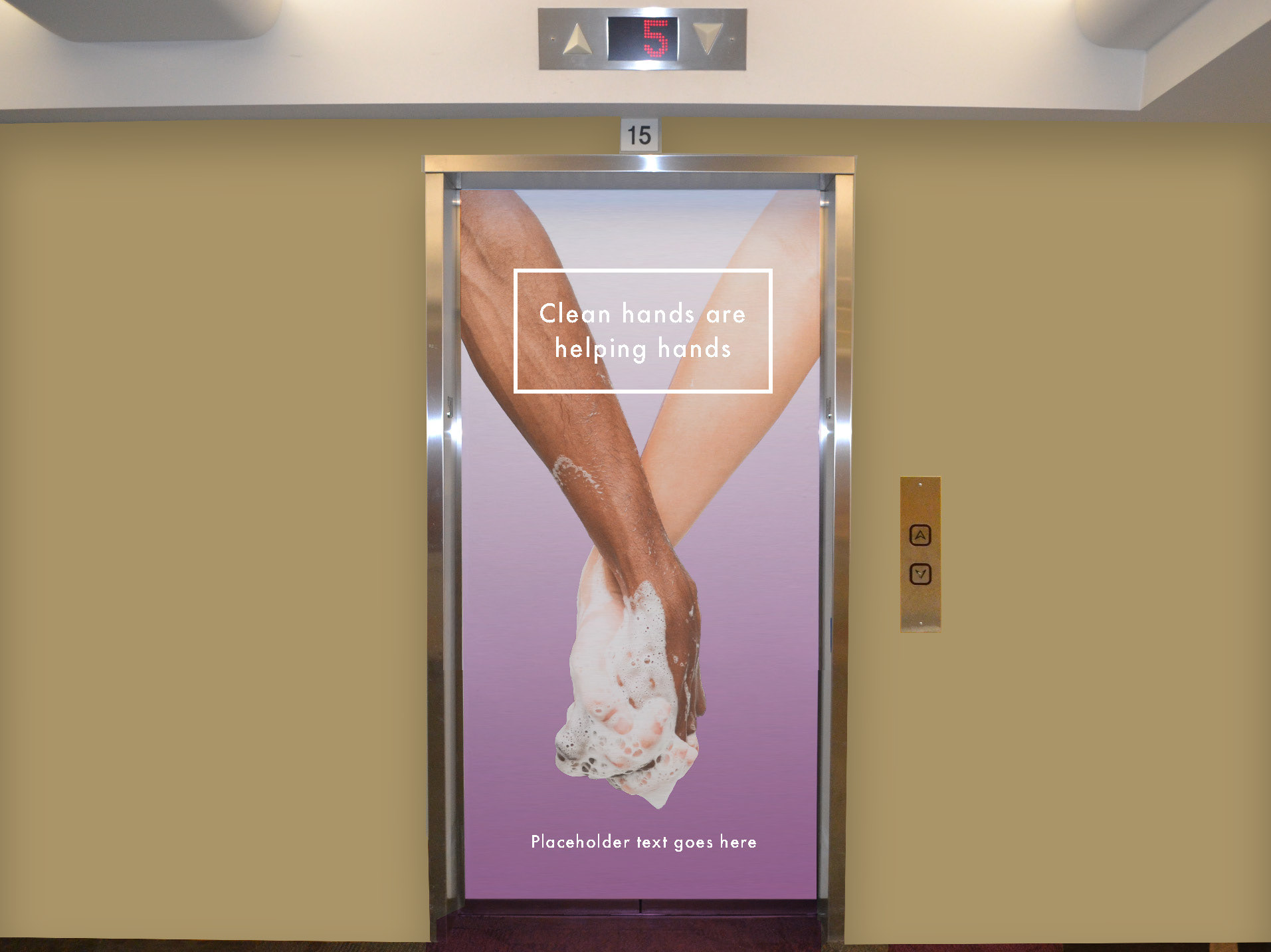
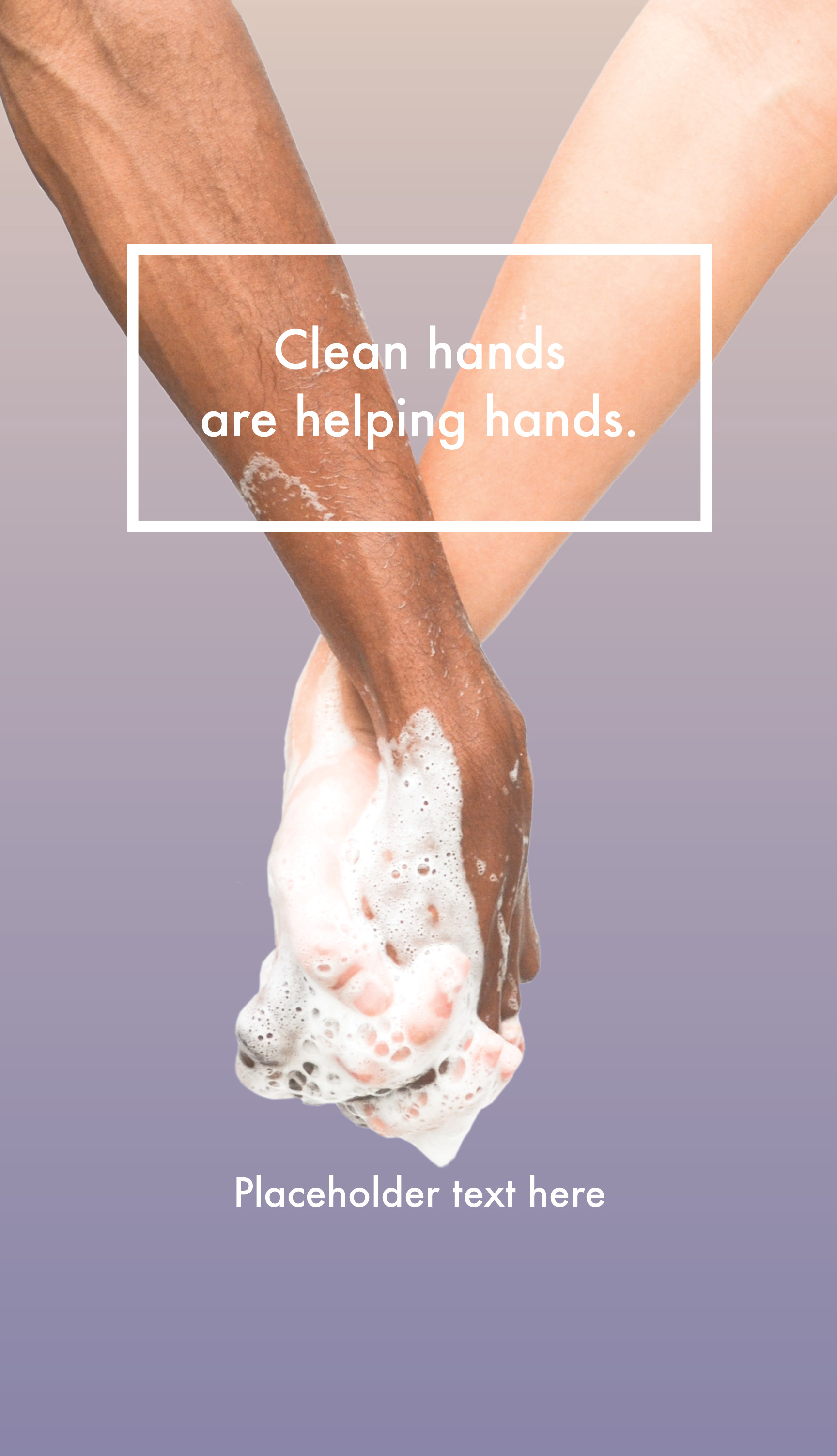
Poster with the caption 'Clean hands are helping hands'. Two soapy hands intertwined in a hand-holding position against a purple background.
Brief:
Vancouver Coastal Health had a variety of old hand hygiene compliance materials throughout their Health Centres and had found that compliance among visitors and staff was still less than ideal. They approached the Health Labs to help them find a design solution, and after jurying the work of five separate teams, the Clean Hands Warm Hearts campaign was chosen to replace the outdated materials.
Research
Location:
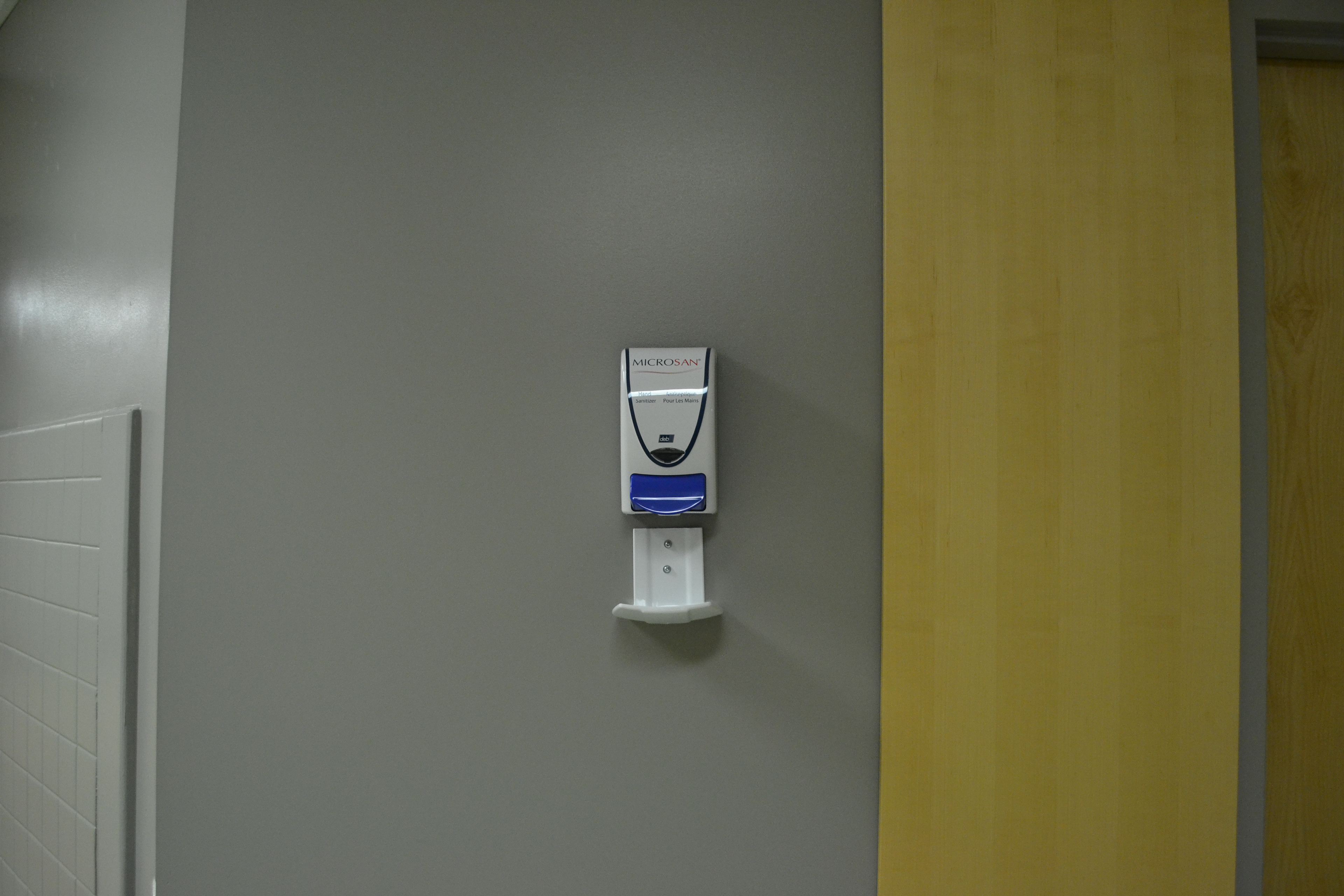
Upon visiting two of the sites (VGH + Lions Gate Hospitals), the following opportunities were identified:
• Elevator wraps (inside and out)
• Back-lit posters - 6' high
• Standard posters
• Small posters
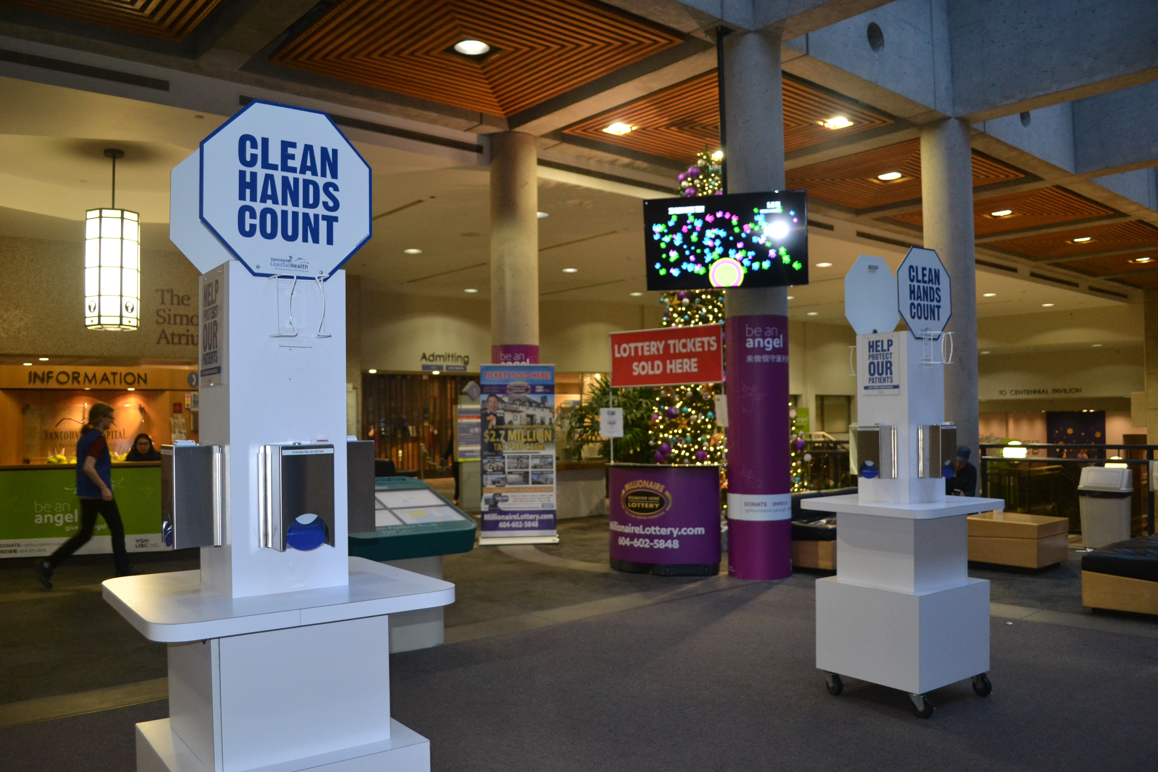
• Hand hygiene kiosks in triage areas
• Video projection
• Dispenser wraps
• Floor vinyl
• Wall vinyl around wall-mounted dispensers
• Wall vinyl on glass in washrooms + patient care areas
• Audio trigger in elevators
• Back-lit posters - 6' high
• Standard posters
• Small posters
• Hand hygiene kiosks in triage areas
• Video projection
• Dispenser wraps
• Floor vinyl
• Wall vinyl around wall-mounted dispensers
• Wall vinyl on glass in washrooms + patient care areas
• Audio trigger in elevators
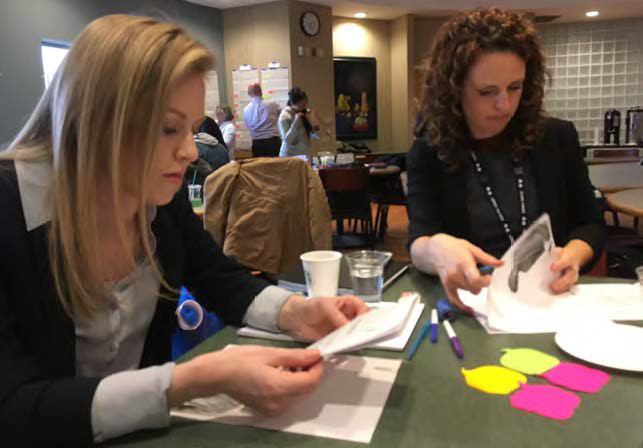
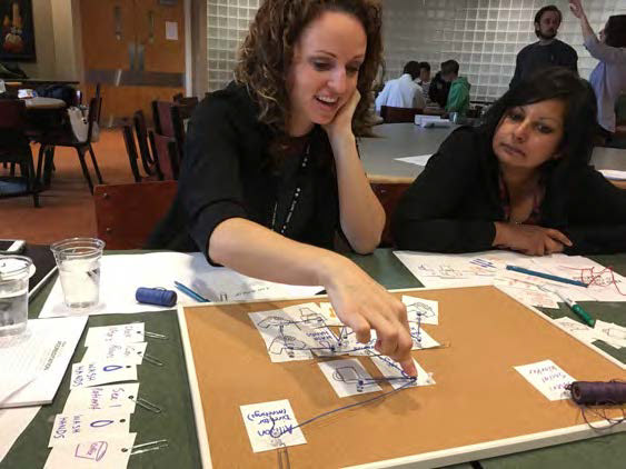
Co-Creation Kit + Session:
We proposed three potential co-creation activities. The activities had cross-over so we could distill the ideas from each into five separate actions and a questionnaire, with instructions in a workbook for the session. Thanks to a dry run, we clarified our actions and offered some additional options to our original plan. One of our decisions was to incorporate as many hand-made elements as possible to encourage participants to write and add to our activities, making them more accessible and less precious than an overly designed kit.
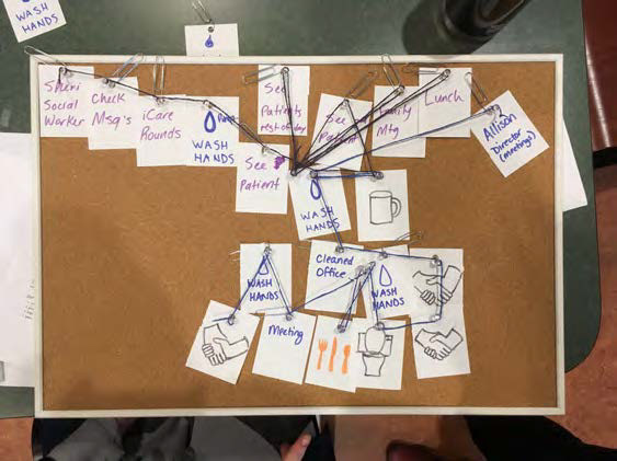
During the Co-Creation session, we explored triggers for hand sanitation. We found that even with educated, invested individuals, it was still possible not always to practice hand sanitation when appropriate.
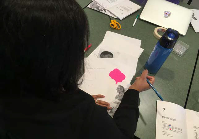
The Mappin' Sanis activity showed us where the hand sanitizers were working, missing, or overlooked. We took away some interesting verbal feedback about how some sanitizers are placed in a hazardous fashion and impeded staff and visitors, and also that some of the sanitizers are hard to see or are not where they could be to encourage people to use them appropriately. There are also pockets where there are too many sanitizers located.
It also seemed as though the hand hygiene of the staff could sometimes be less than optimal. Whatever our final campaign was, it needed to address both visitors and healthcare professionals. Some professionals were quoted as saying that they were too experienced to be told to wash their hands.
During the Co-Creation session, we explored triggers for hand sanitation. We found that even with educated, invested individuals, it was still possible not always to practice hand sanitation when appropriate.
The Mappin' Sanis activity showed us where the hand sanitizers were working, missing, or overlooked. We took away some interesting verbal feedback about how some sanitizers are placed in a hazardous fashion and impeded staff and visitors, and also that some of the sanitizers are hard to see or are not where they could be to encourage people to use them appropriately. There are also pockets where there are too many sanitizers located.
It also seemed as though the hand hygiene of the staff could sometimes be less than optimal. Whatever our final campaign was, it needed to address both visitors and healthcare professionals. Some professionals were quoted as saying that they were too experienced to be told to wash their hands.
The creative solutions activity highlighted that the staff preferred a reward-centric model to hand hygiene for staff, in the form of potential time off or financial remuneration for those who practice hand hygiene regularly. People wanted positive reinforcement for hand hygiene compliance.
The spectrum activity helped us to organize what imagery and colours resonated with the participants and went on to inform the colour palette that we chose for the final project.
The questionnaire allowed the participants to add their perspectives to what they felt would make a hand hygiene campaign successful. We also documented verbal feedback as each activity happened and came away with more fully informed perspectives.
Creative Outcomes
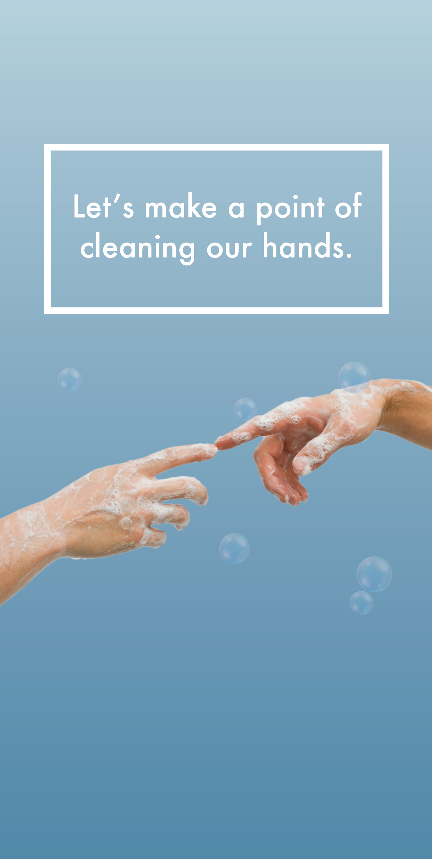
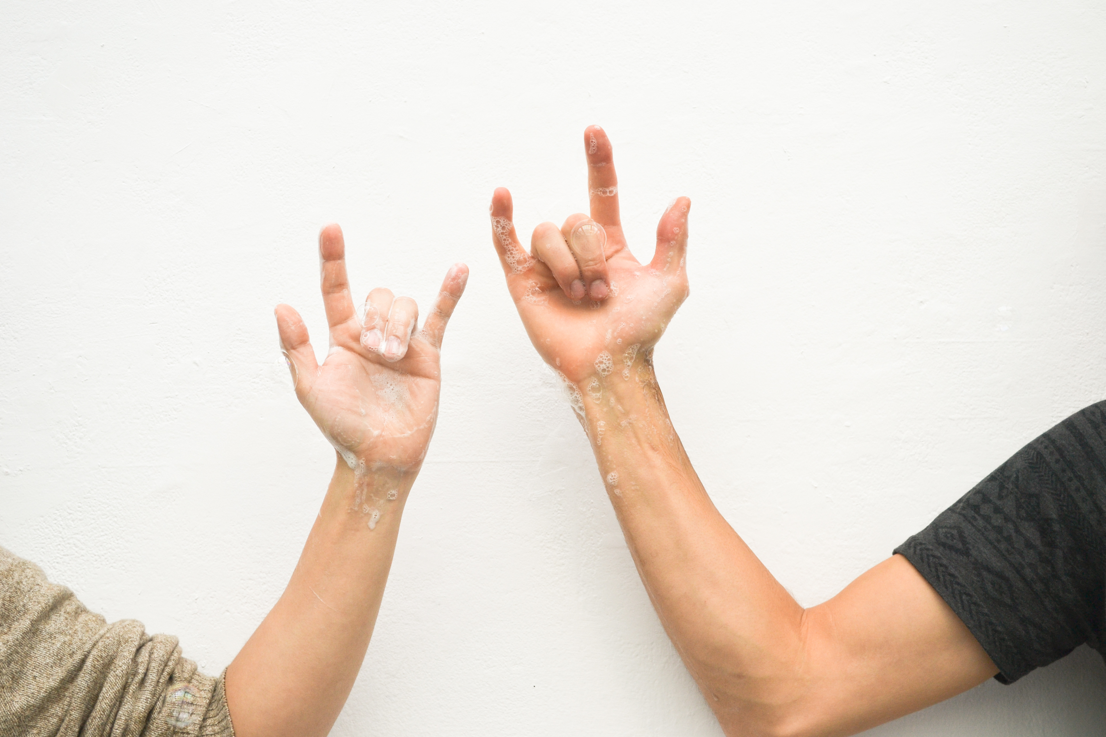
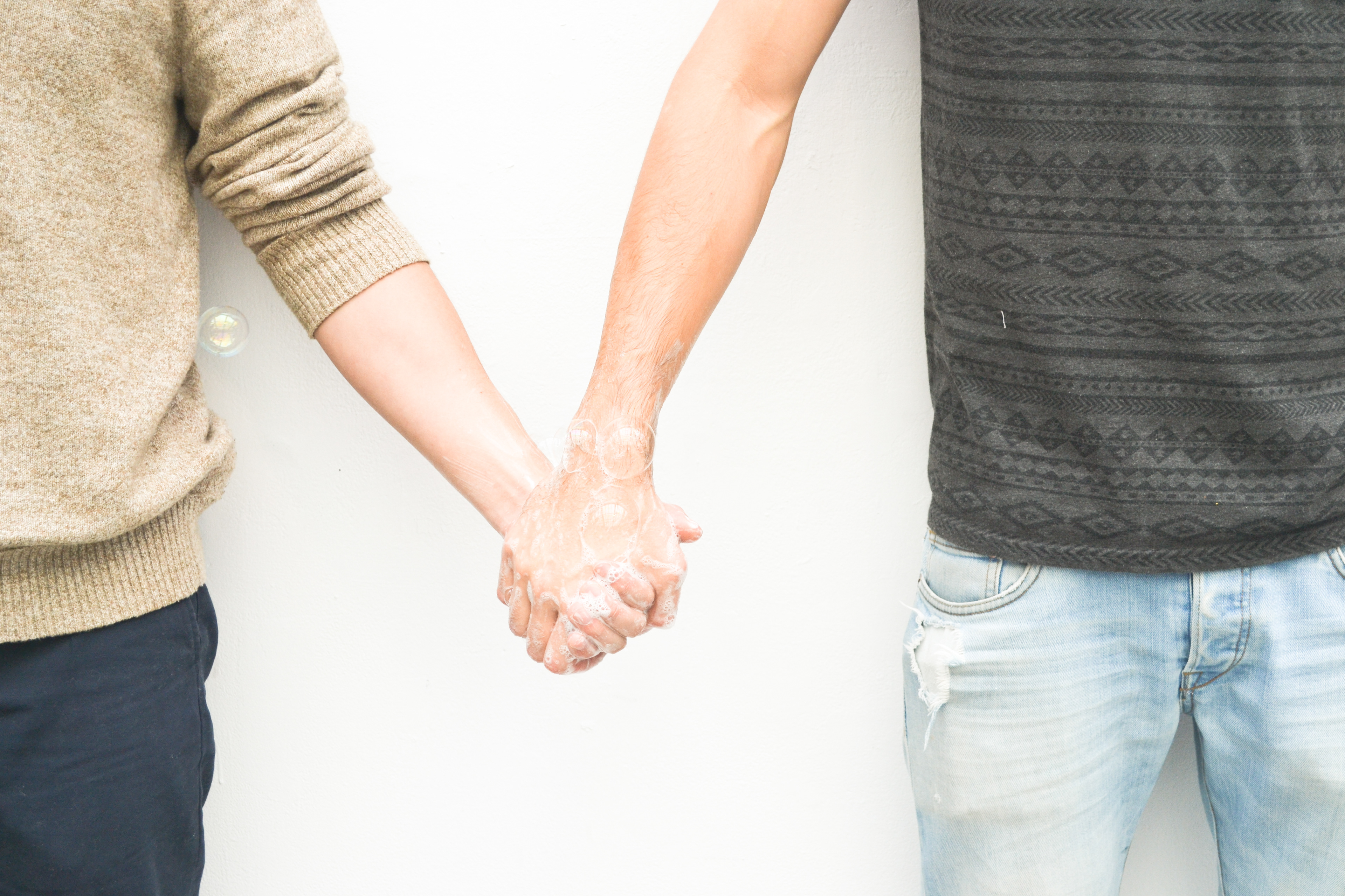
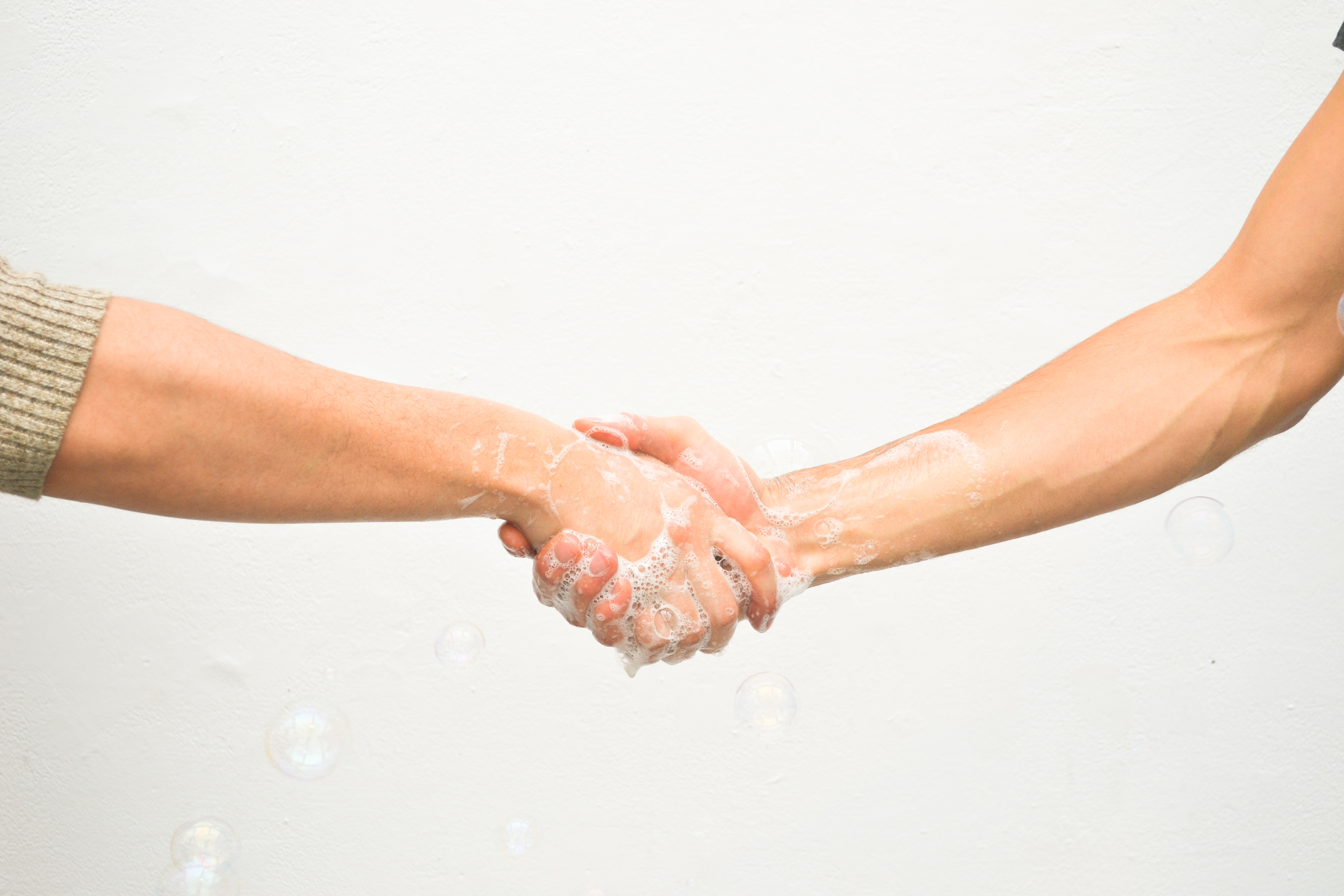
A few of the themes that we had identified as desirable were empathy and humour. We researched other empathy-driven campaigns, including pieces focusing on emotional intelligence. I decided to focus on hands as the body part that would be addressed by the campaign in positions that supported these themes, such as 'heart hands', hand holding, thumbs up, the ASL for 'I love you' and 'I care', and came up with a few iterations, some featuring people with their hands in supporting positions, and some focusing on the hands themselves.
We asked: what is the most empathetic motivator for hand hygiene? This led to the development of 'Clean Hands Warm Hearts' as the guiding theme for this campaign.
We asked: How might we leverage empathy to motivate visitors and staff in healthcare facilities to adopt higher standards of hand hygiene? This led to the development of 'Clean Hands Warm Hearts' as the guiding theme for this campaign.
Concept Development
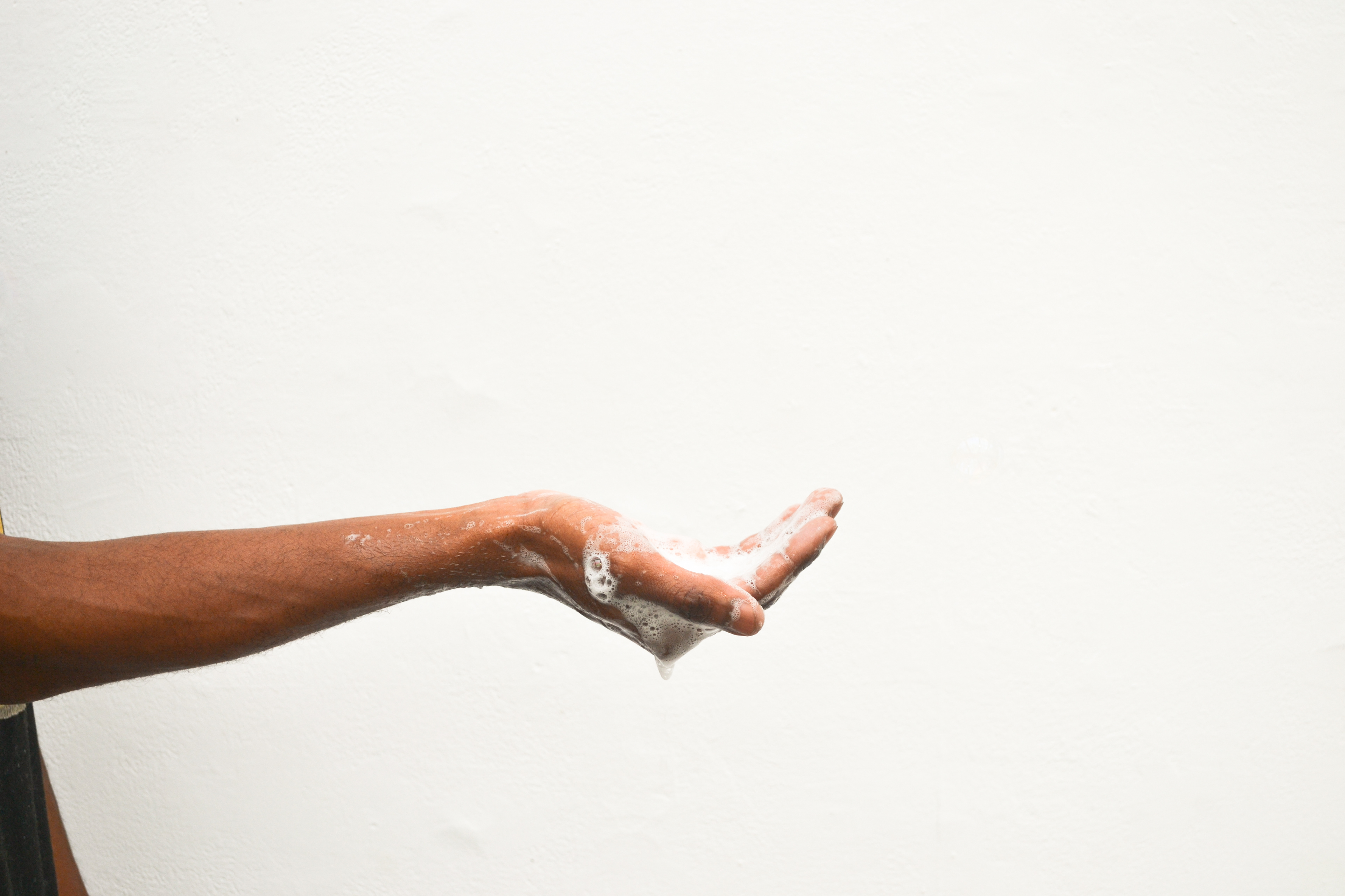
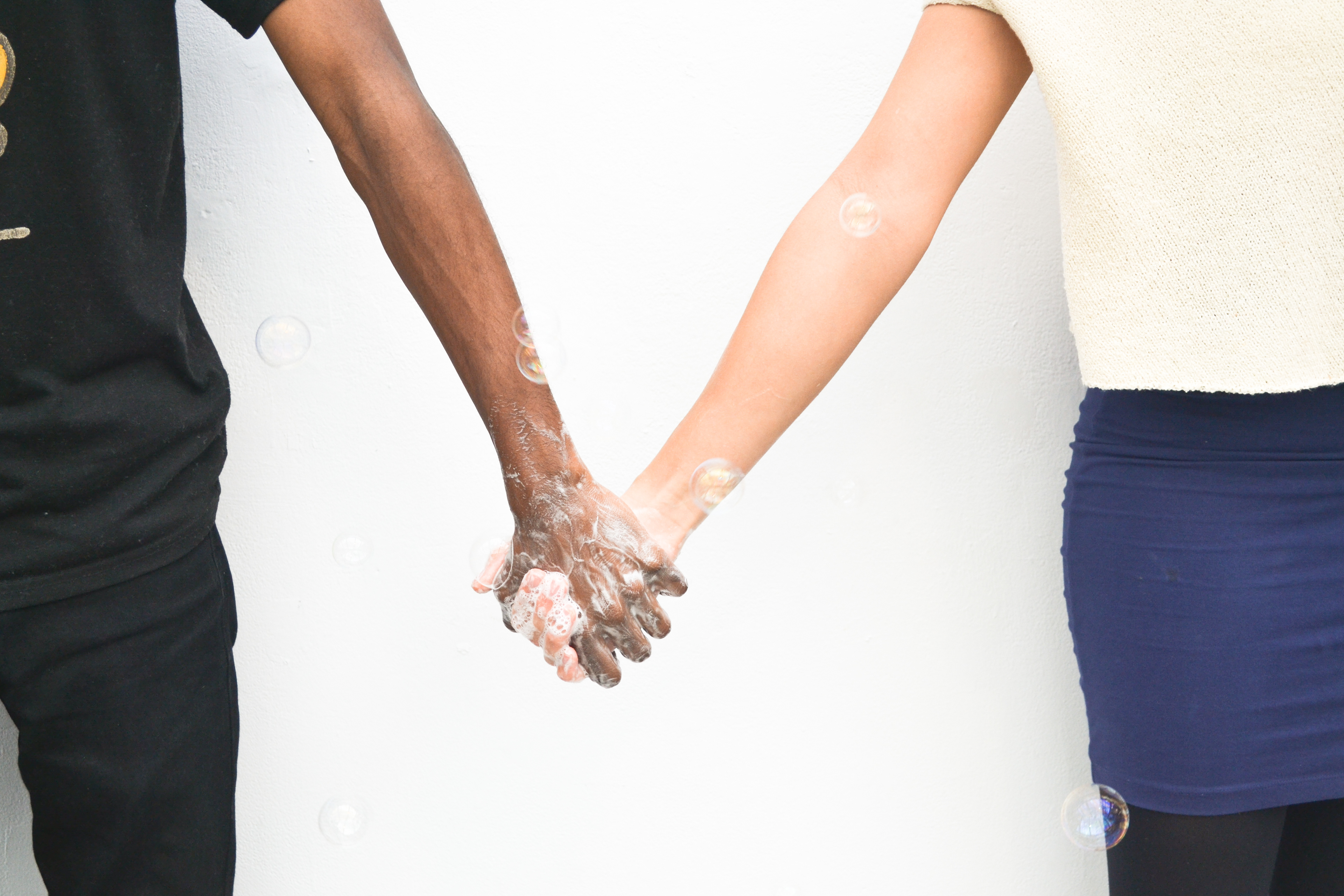
Further developing the concept, we took some test photos of soapy hands making the heart signs and other gestures, and made the move to a soapier look.
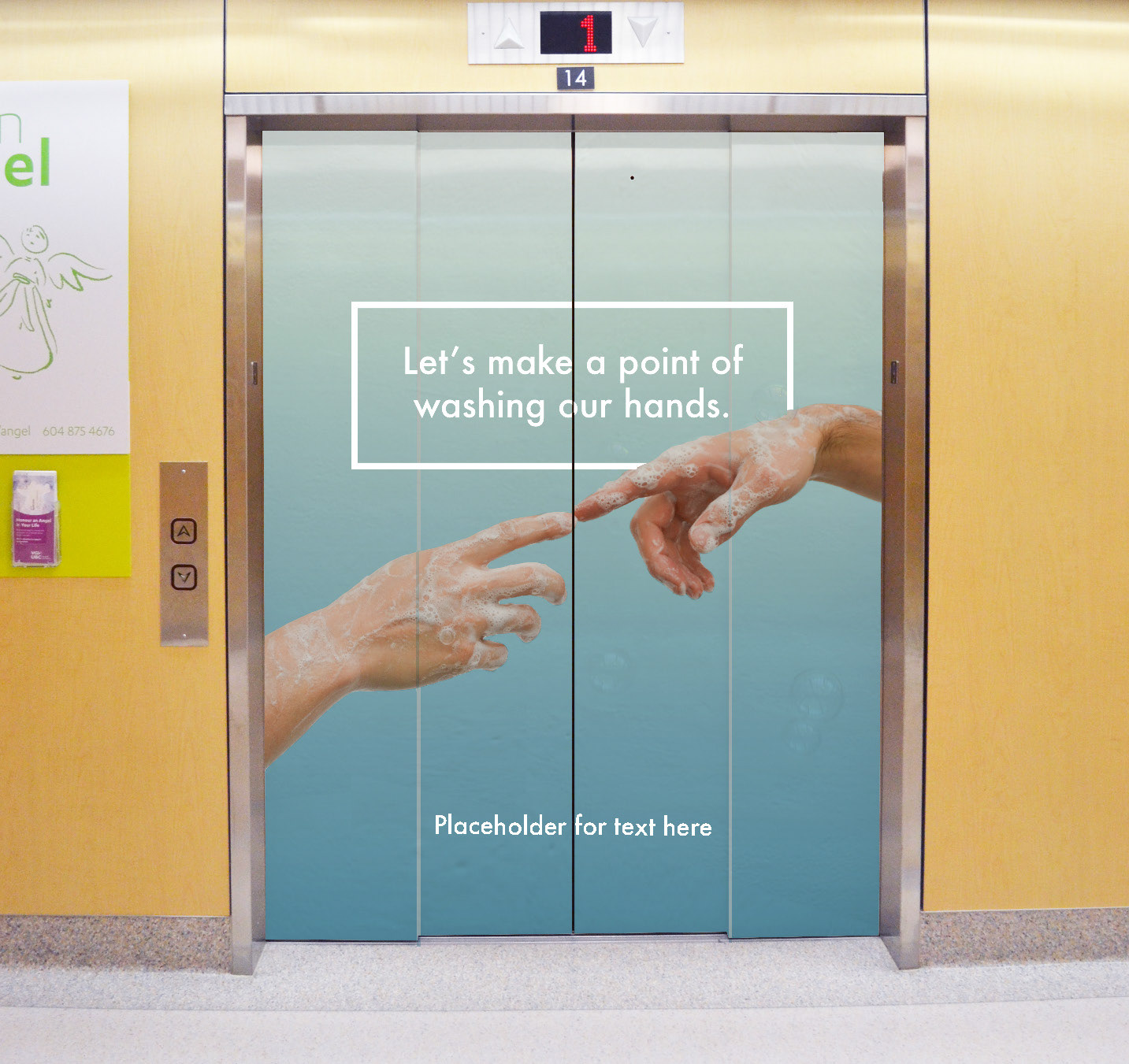
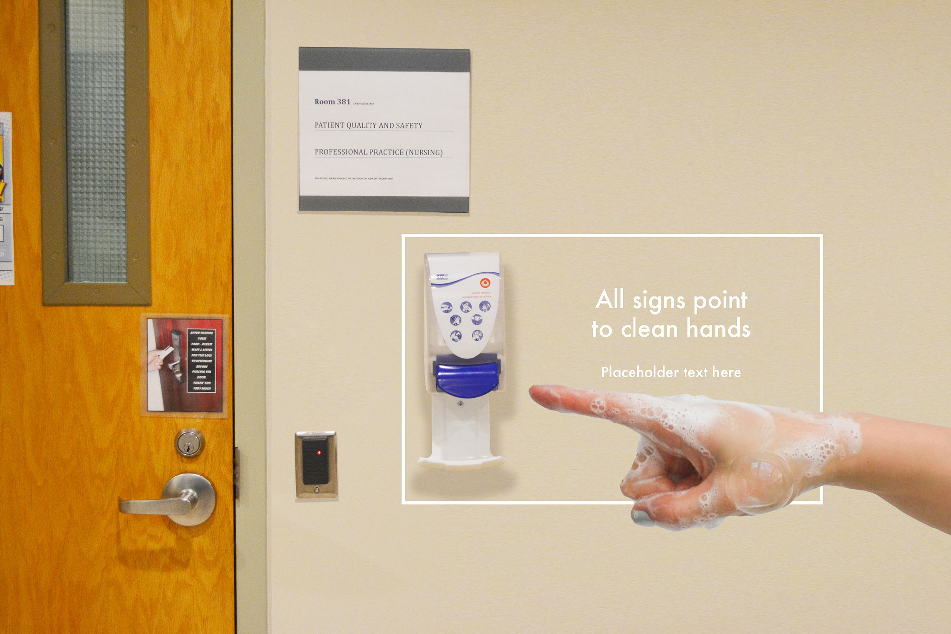
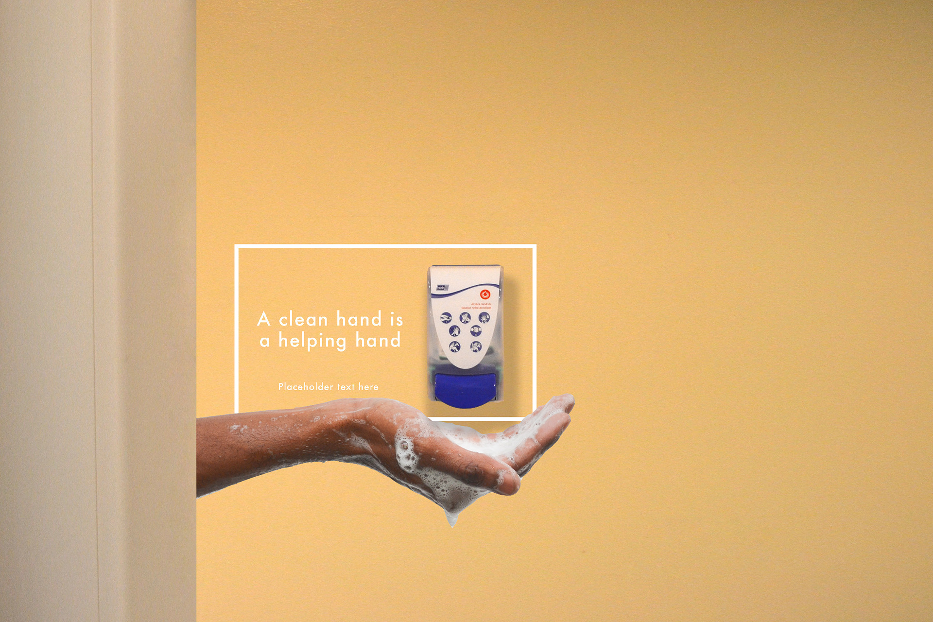
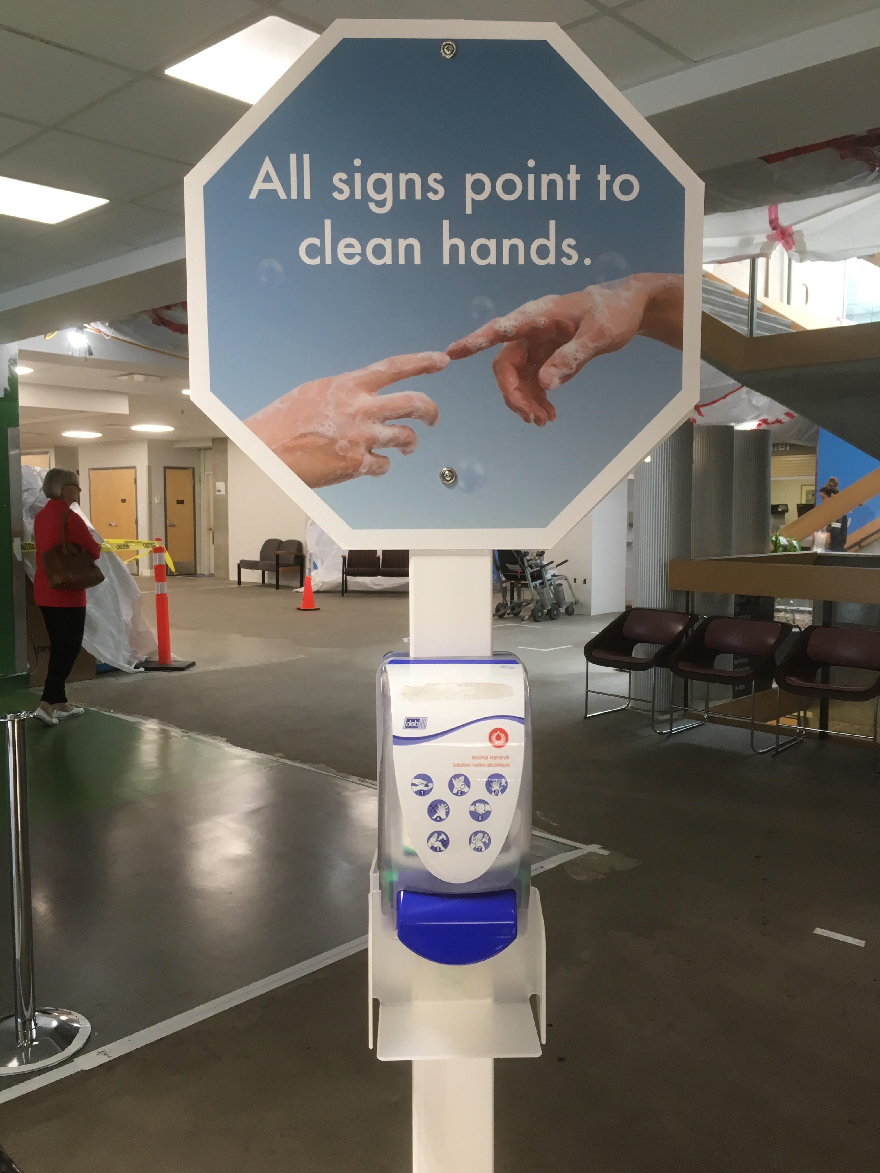
Our tests worked well, so we organized a photo shoot with multiple models of varying skin colours and genders and took shots of our models creating various shapes with their hands, including 'heart hands', high-five, ASL 'I love you', hand gestures based on Michelangelo's 'The Creation of Adam', holding hands, pointing, and many others. We liberally applied soap and blew bubbles, taking over 400 photos. We went to VGH and got the location shots we needed for mock-ups and imposition.
We narrowed the photos down to about 40, edited them for white balance, and started experimenting with layouts.
We started by choosing hand placements that would work well when animated by the elevators opening and closing, discovering quickly that not all hand signals would work well for our application while developing additional supporting phrases for the campaign. We determined that gradients in our colour palette would work better than solid colours and that a cleaner treatment was needed for the text.
We moved from our placeholder Helvetica Neue to Futura, the font VCH favours in their style guide.
Client Mockups
VCH was excited with the campaign as pitched with the mockups (below.)
Finished Product
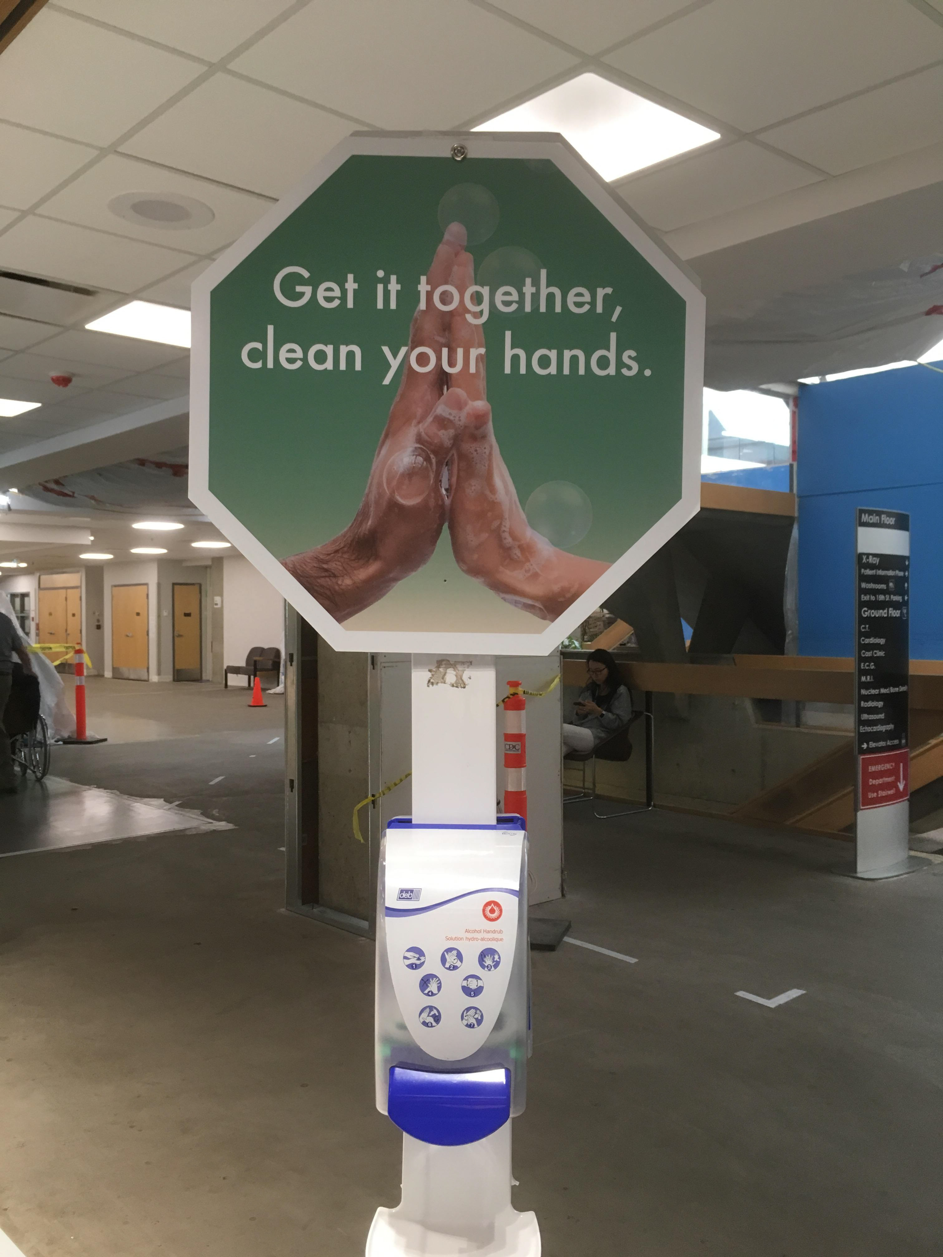
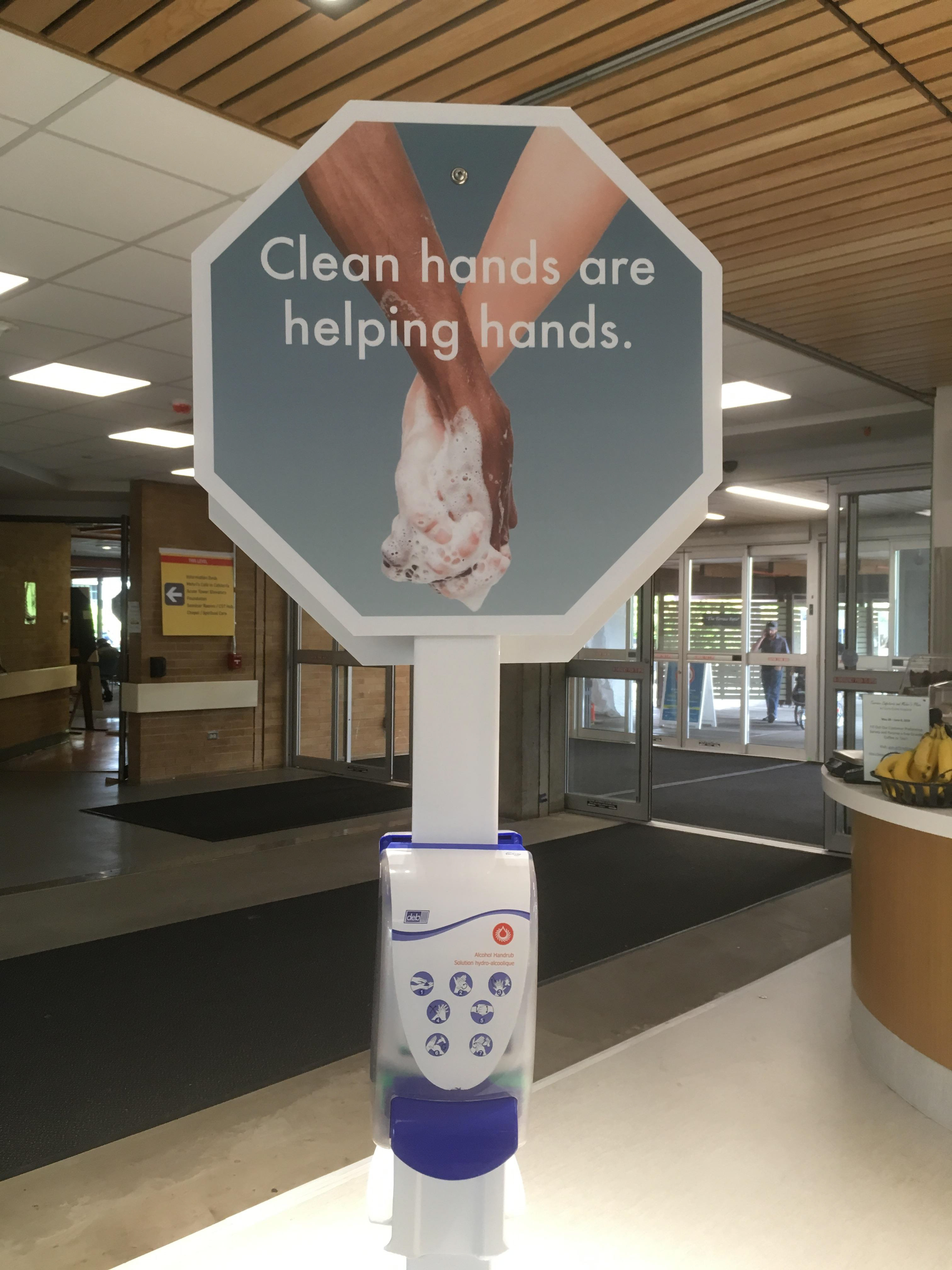
The finished project has applications of this campaign as elevator wraps, wall decals, posters, and kiosks. The effect of the elevator doors animating the hand gestures creates a reaction of delight in the viewer, while the calm colours, gently humorous use of scale, and catchy phrases remind people in an empathetic and humorous way to practice hand hygiene because it is the loving thing to do.
Project Team
Chelsea Bell Eady
Stephanie Lai
Sabbah Moffidi